The Story Behind My Taj Mahal Drawing

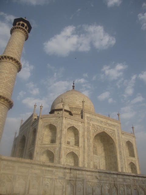
The Taj Mahal in India is regarded as the finest example of Mughal architecture. It was built by Mughal emperor Shah Jahan in memory of his third wife, Mumtaz Mahal, and is widely recognized as the jewel of Muslim art in India. The Taj Mahal is a very important and iconic piece of art and architecture, a UNESCO World Heritage Site. 

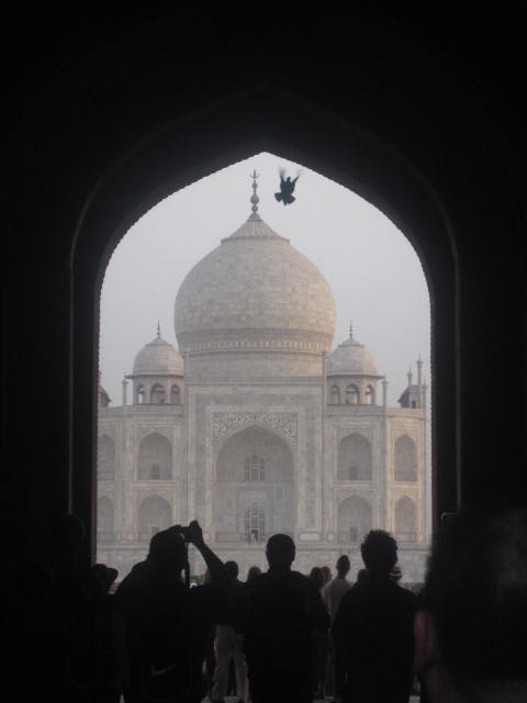
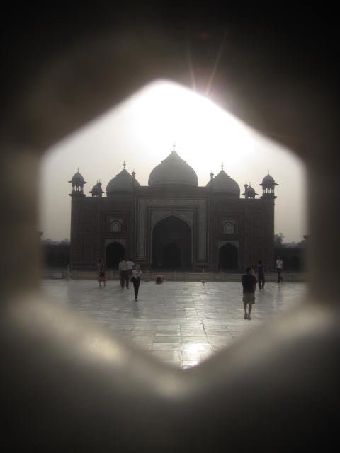
This hand drawing was created from photographs and sketches I did the day I visited the Taj Mahal with my close friends to celebrate and mark our 30th birthdays, a few years ago now. We started our day around 5am so we could beat the crowds, took an auto-rickshaw to the gates, and paid our entrance fee. Walking down the path, you could feel the excitement build up amongst us. As we walked through the old arches we were met with the famous view looking straight at the Taj Mahal, reflecting in the water and trees lining the pathways. 

A few hours of walking around and taking it all in, we sat and reflected on where we were, together as friends, in this amazing setting. I love this last picture because it reminds me of the all vibrant colours in India, the bright orange, the mint green, the pretty blues, the array of pinks, so beautiful. 


Interior and Architectural Ink rendered Hand Drawings

Interior + Architectural Ink rendered Hand Drawings

Rendering, by hand, with Ink Marker Pens

Over the last few weeks, I’ve been producing some drawings to show my students as examples for a ‘Design Communications’ class I'm teaching this term. I always think it’s best to show examples of your own work - that way the students see I can actually do what I’m teaching and expecting of them, and not just pull images from google.

In my opinion, we are too quick to jump onto computers to render our work and there is a beauty in hand-drawn and hand-rendered work - an important skill to grasp before moving on to rendering in programs such as Photoshop, an office standard.

So, I'm sharing the examples with you, taking you through this process, and talking about what I use to render them, and how you can create your own hand-rendered drawings like these.

Ink Marker Pens for Interior Design Rendering

I have used a range of different ink markers in the past and have built up a little collection ranging from ProMarkers and Copic to Tria. I'm not biased to any brand as colour and ink flow are the most important feature so whatever I have to hand is usually good enough.

I started out with ProMarkers and then Tria before investing in a range of Copic markers.

I recommend investing in 3 to 4 pens to start with - a light and a darker grey, a brown for wood, and if your budget allows then a blender pen too. You can always render into the ink with coloured pencils.

Paper for Ink Rendering

Working with ink markers can be challenging and frustrating but it’s one of those skills that gets easier with practice so make many copies of your work before you ink the final drawing.

I often find that the paper I use can really make a difference in the final look of the image. Poor quality paper will have your ink flowing into each other and run. Standard sketchbook paper, if not thick enough, will do the same and can sometimes become a bit transparent with ink or bleed onto other pages so keep this in mind when working in your sketchbook.

There are ink marker pads on the market but they are pricey. Personally, I don't do enough of these drawings to make that investment so I’ve been using a thick card stock paper that has a watercolor-like absorption to it. Look for watercolour sketchbooks and see what the paper thickness and texture are like - a nice smooth finish is ideal. 

Try it yourself

Hopefully, this has encouraged you. Give it a try, less is more with ink marker work so try to build up the layers of ink as you go. Render and then stand back, add into the material or shadow and stand back.

If you don’t have a drawing to work on, take an image from a design magazine, draw out that image using a black ink fine liner drawing pen, or just in pencil for now, and start to render it.

Begin with the lightest colours and build up from there, do it in layers like a wash of colour and add in other colours to create shadow and depth. The hardest thing is knowing when to stop. 


See our Pinterest board for more examples


READ MORE BLOG POSTS


The Story Behind My Portobello Baths Drawing

This is a drawing I have just finished of Portobello Baths in Edinburgh which will be auctioned at the annual Portobello Amateur Swimming Club and Water Polo Team's summer ball. It shows the beautiful Victorian baths, located facing Portobello beach.  

This building holds a lot of memories for me; many evenings spent here watching my Dad play Water Polo and proudly coaching the team.  It is where I learned to swim, alongside my big brother and little sister. Where I competed for badges and medals, ferried back and forth by our patient Mum, and where I caught many colds leaving with wet hair (Mums are always right!).  When my brother made the Water Polo Team, my little sister and I would play hide and seek up in the disused roof space. Now owned by the council, it has been redeveloped into a modern public swimming pool but its traditional Victorian beauty still stands proud, filled with many childhood memories.

Above is a photo of the drawing I did of Portobello Baths, Edinburgh.  It was auctioned off at the Portobello ASC's Centenary Summer Ball last weekend and raised an amazing £300 for the club.  


For more information on the club click Portobello Baths